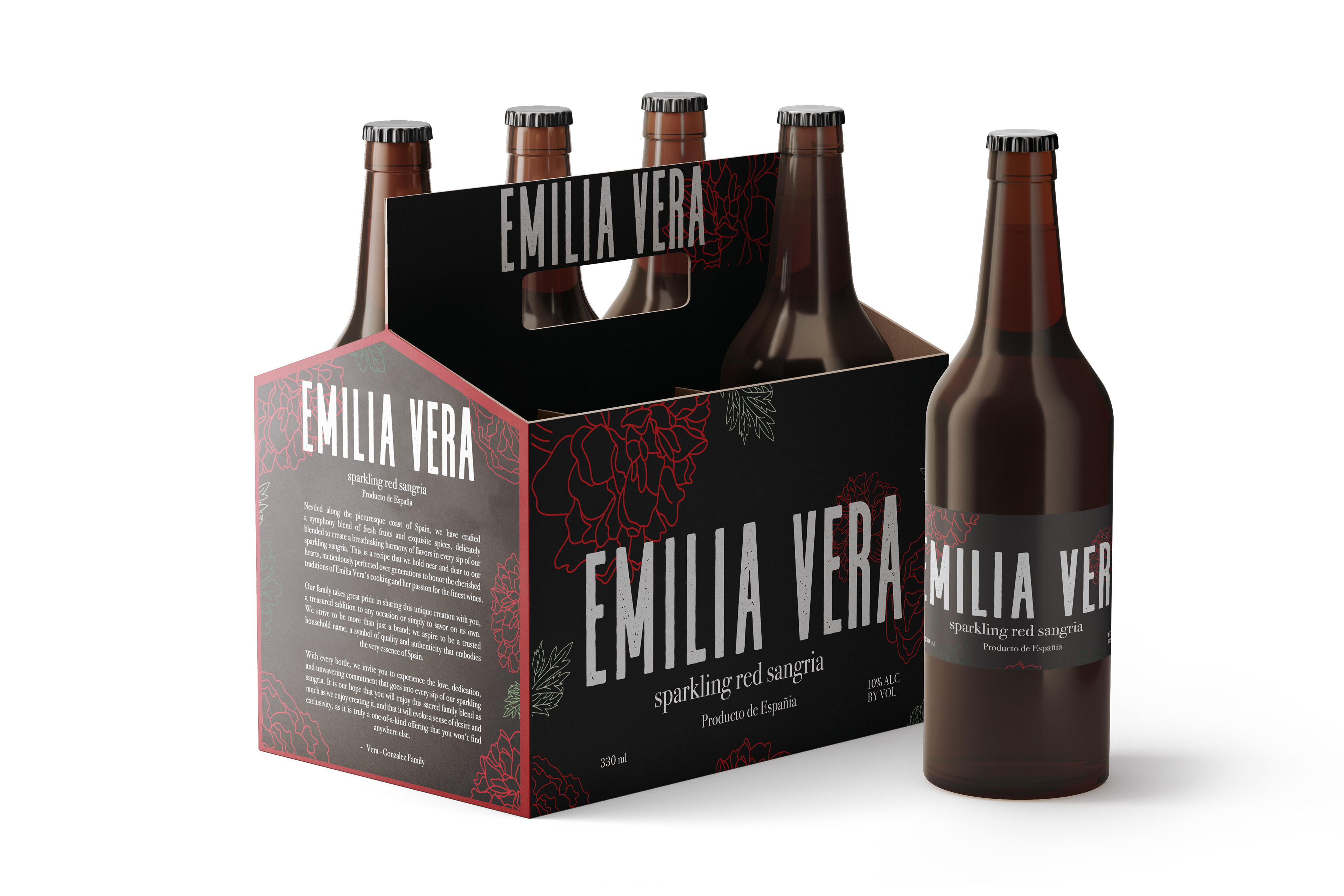
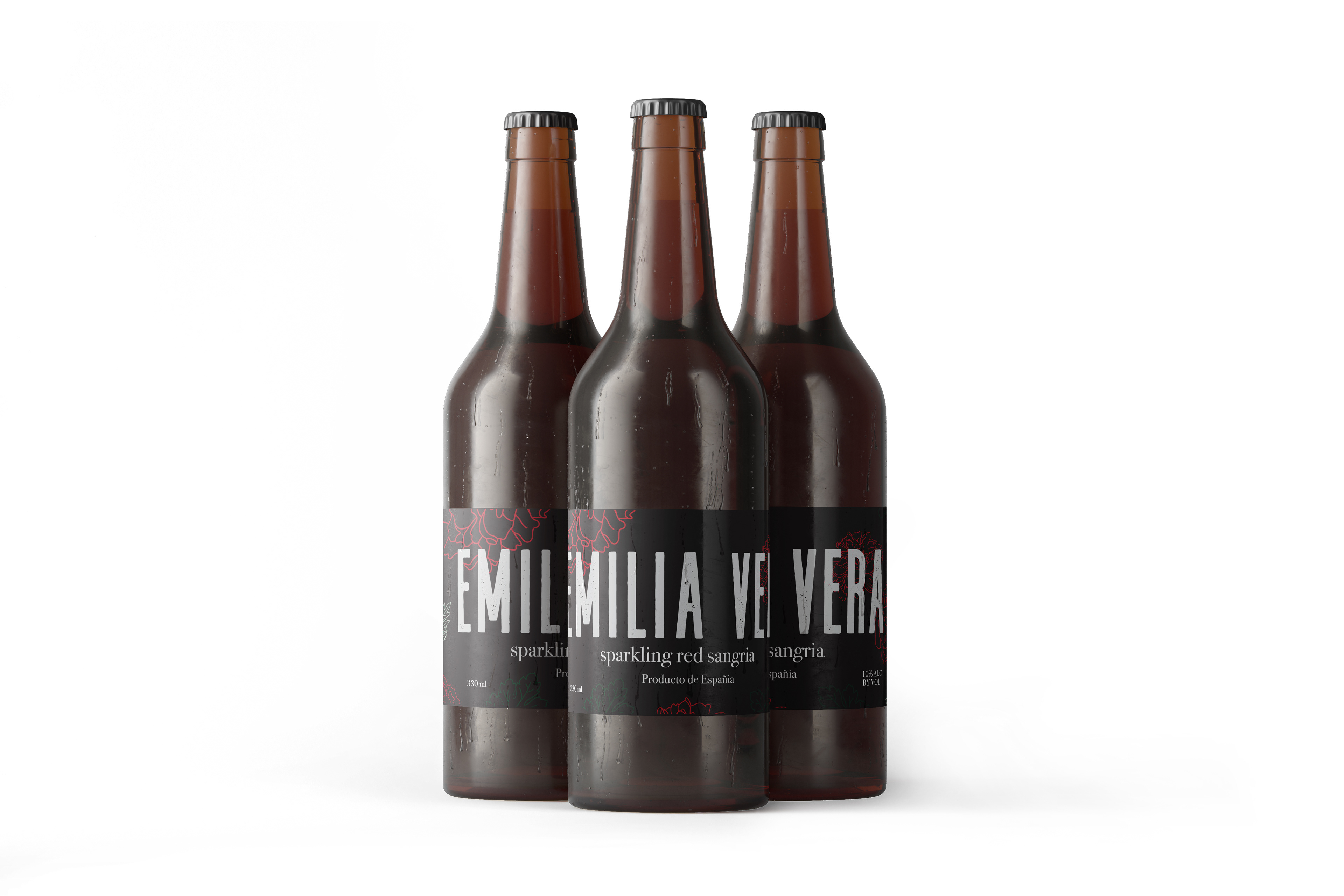
The label features a clean and elegant design with a touch of nostalgia that pays homage to Emilia Vera's legacy. The label's name is prominently displayed in a bold and sophisticated font, emphasizing the brand's identity and creating a lasting impression. The carnation illustrations are strategically placed to add a touch of playfulness to the design, and the use of color helps to differentiate between the two types of sparkling wine.


The black label, is bold and daring, with a black background that signifies strength and sophistication. The carnation illustrations in shades of red provide a dramatic contrast, making the design pop.
The white label, on the other hand, is characterized by a crisp, clean aesthetic, featuring a white background that symbolizes purity and simplicity. The carnation illustrations are in shades of pink, bringing a soft and feminine touch to the design.
Overall, the Emilia Vera Sparkling Wine label design perfectly represents the brand's identity and heritage, embodying the love and passion for wine that has been passed down through generations. It is a design that will stand the test of time, appealing to both modern and traditional wine drinkers alike.
I crafted the copy for the company's package messaging and values to create a compelling and engaging story for their target audience.


