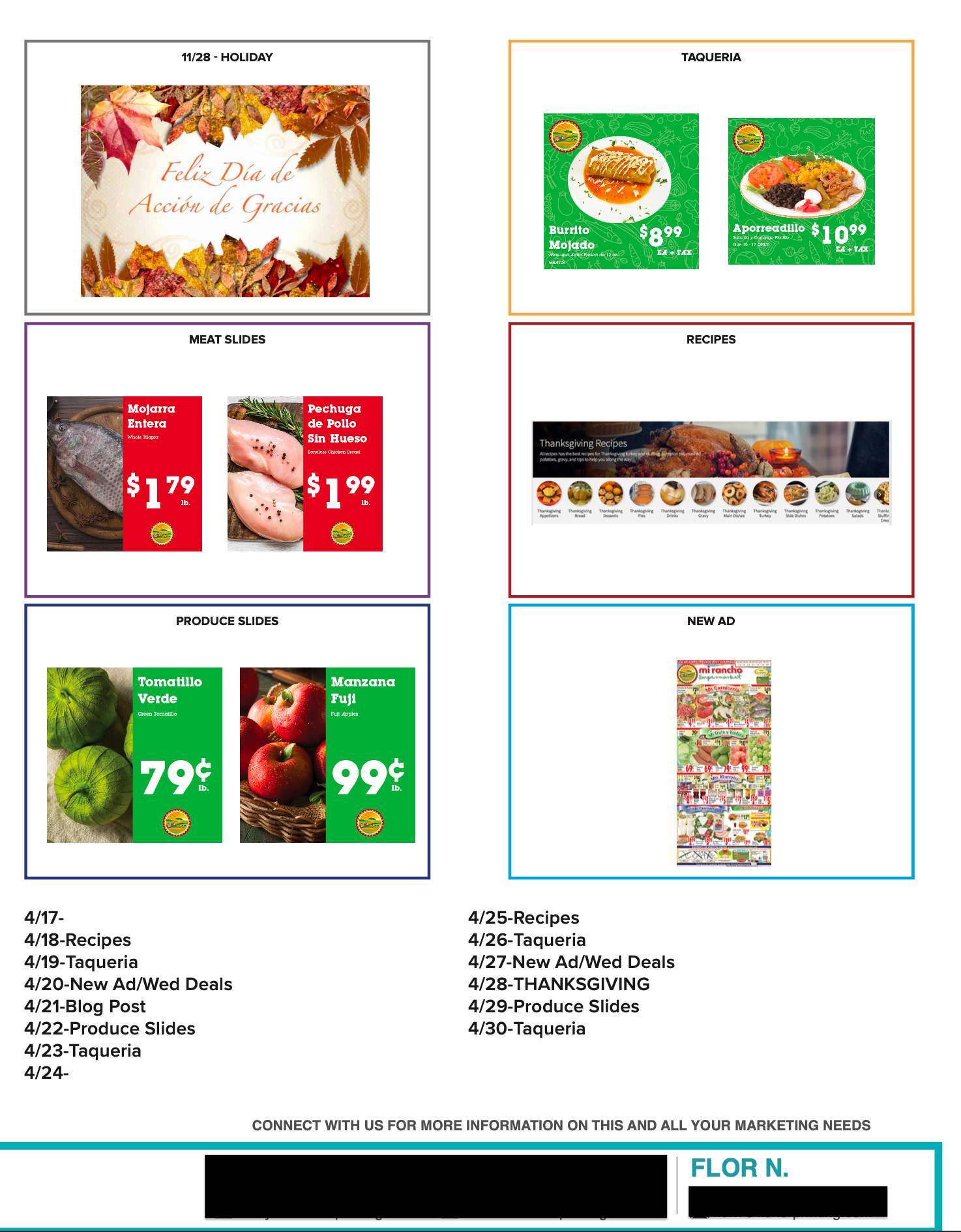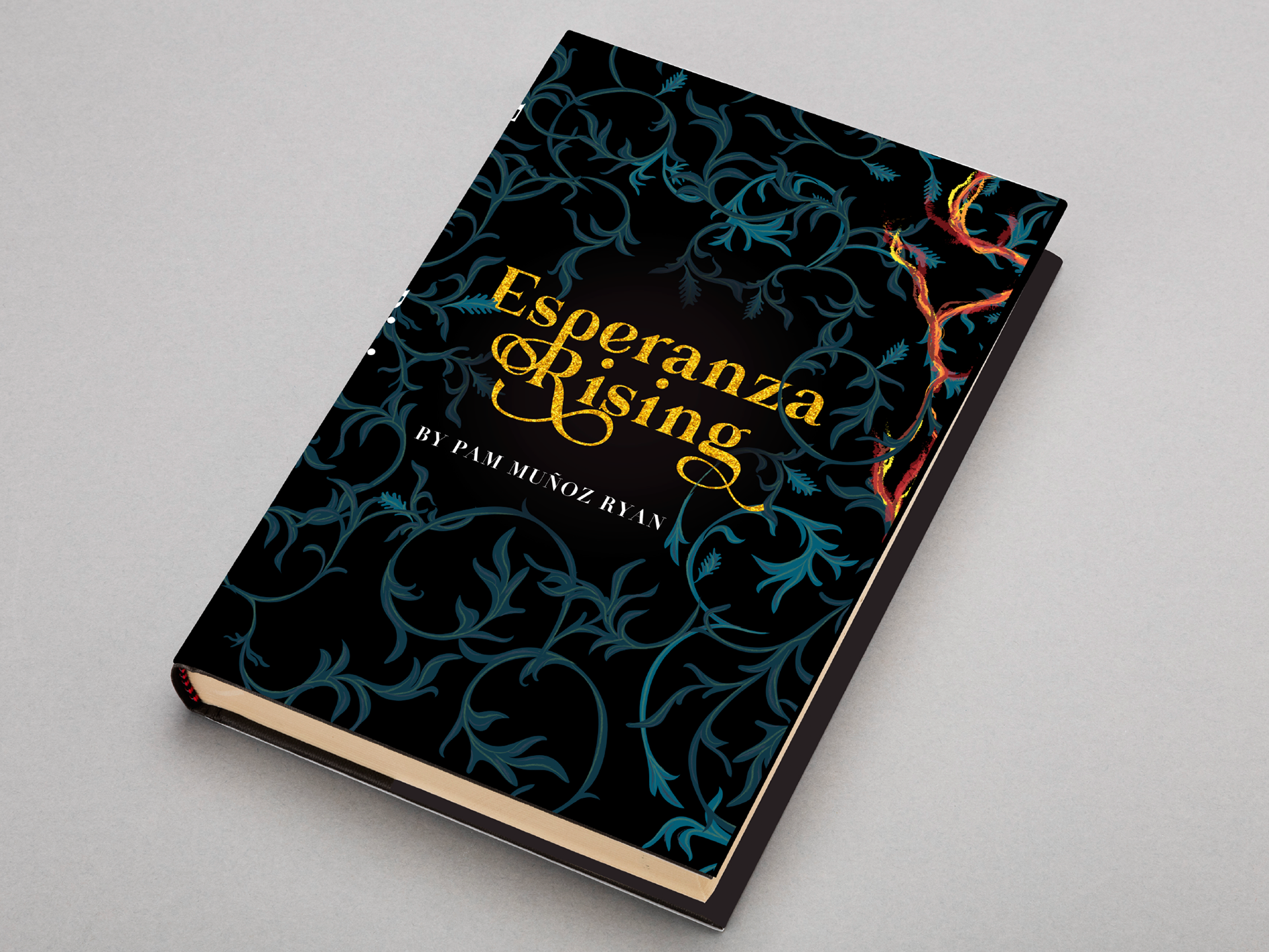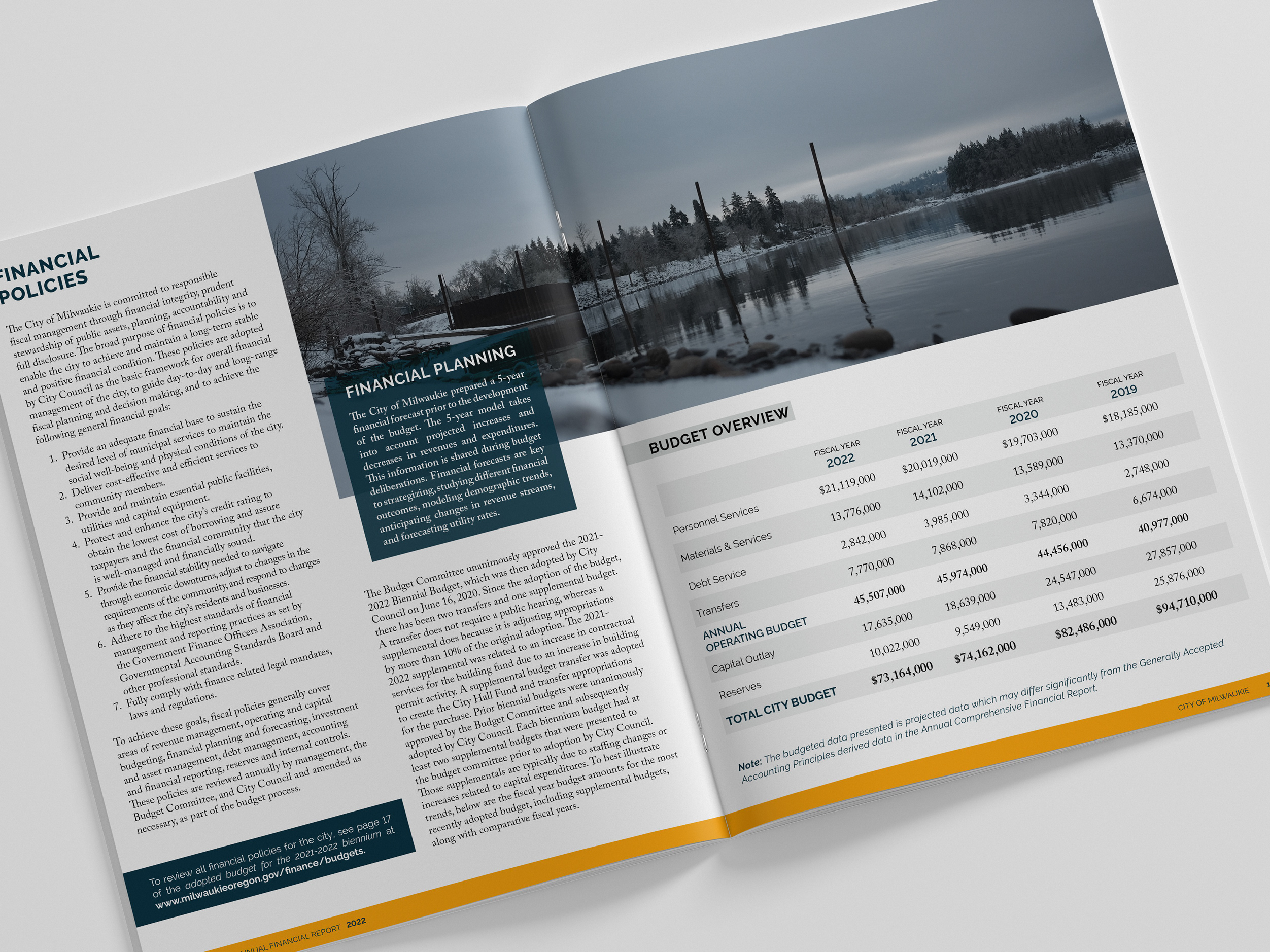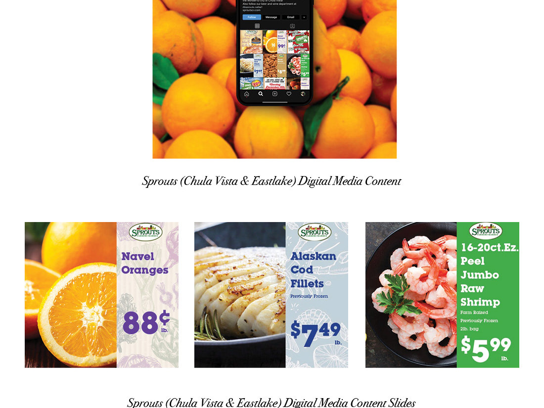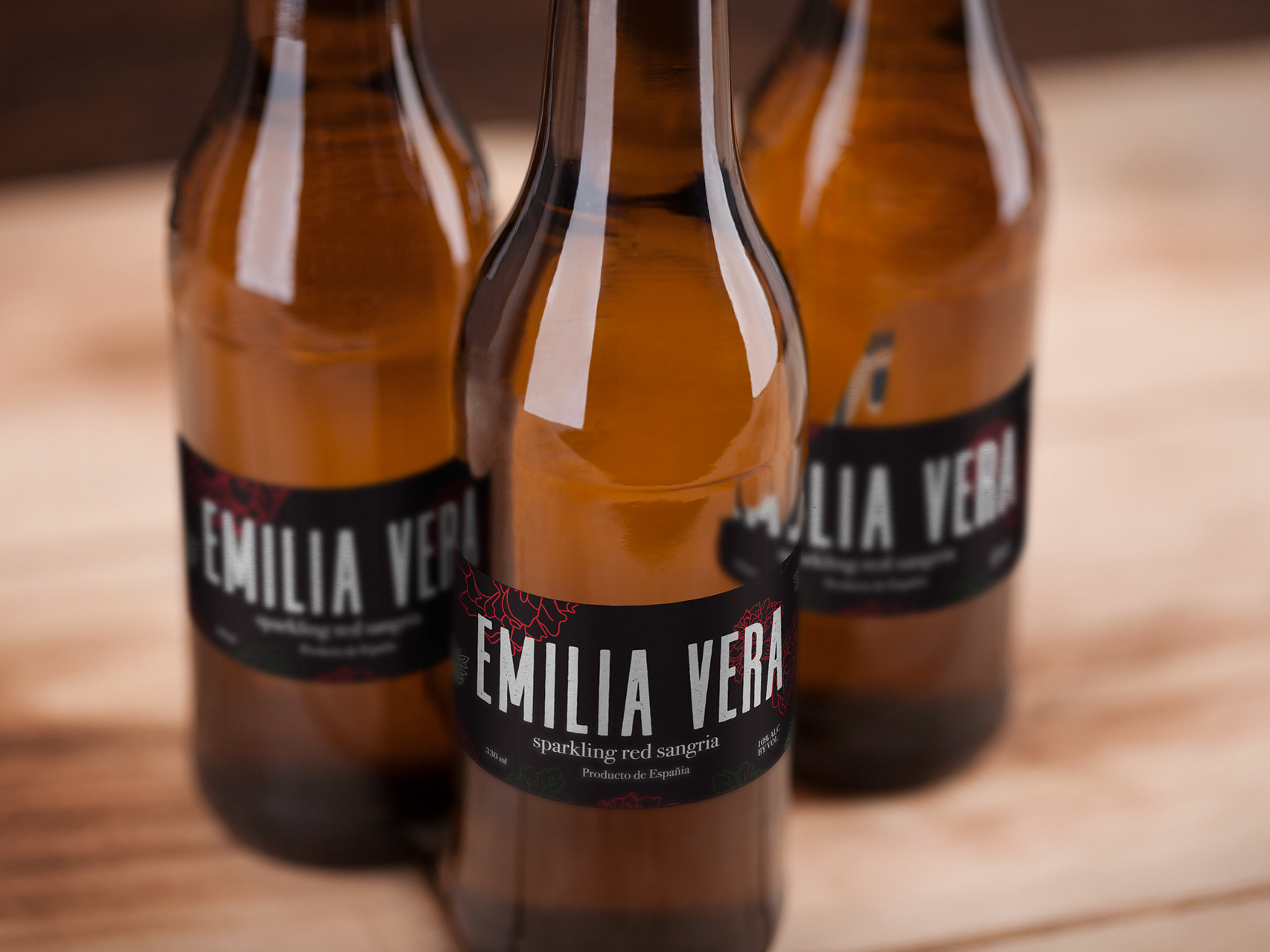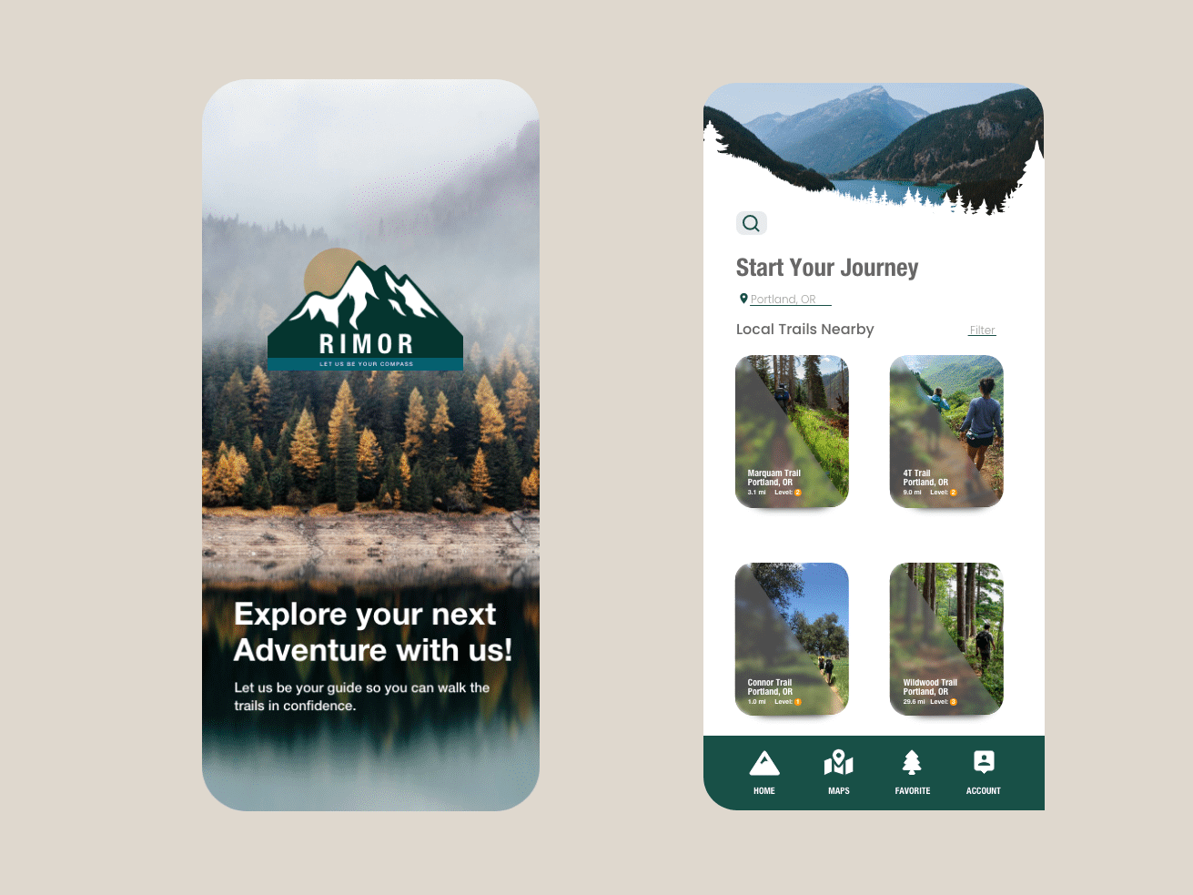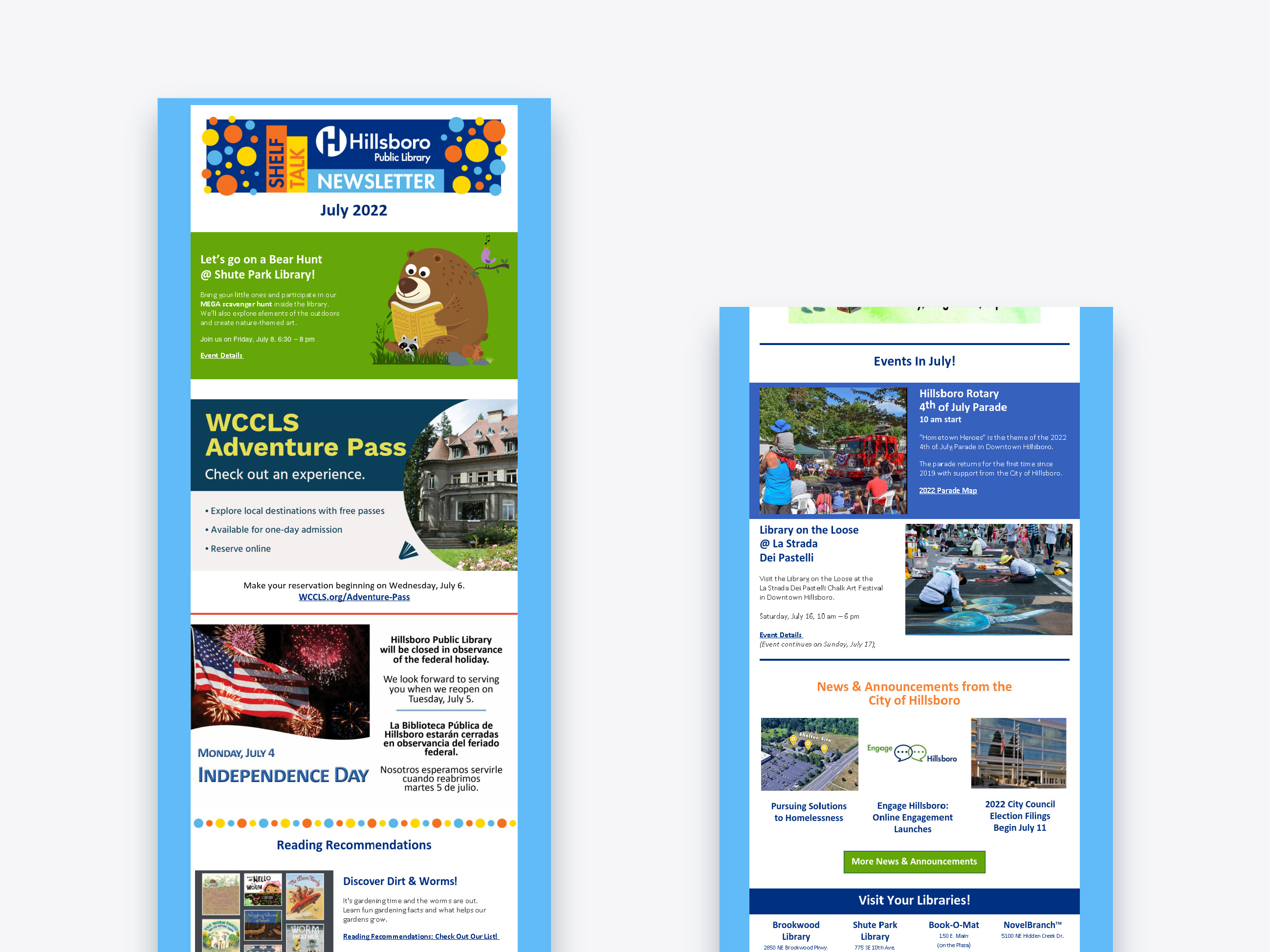
My process began by conducting thorough research on the brand and their target audience. I wanted to ensure that the graphics I created resonated with their customers and represented the brand accurately. After gathering the necessary information, I started sketching out ideas and concepts for the graphics.
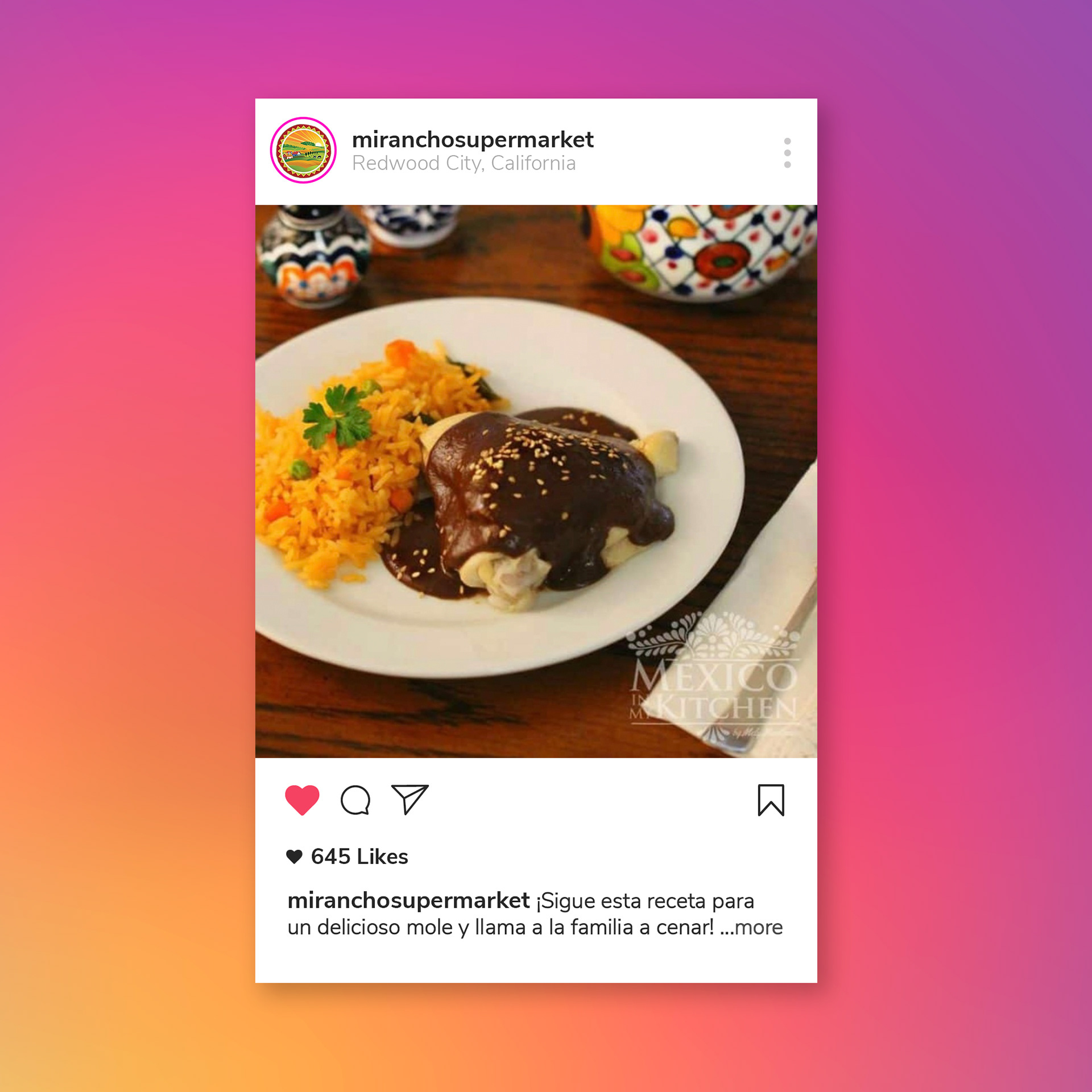
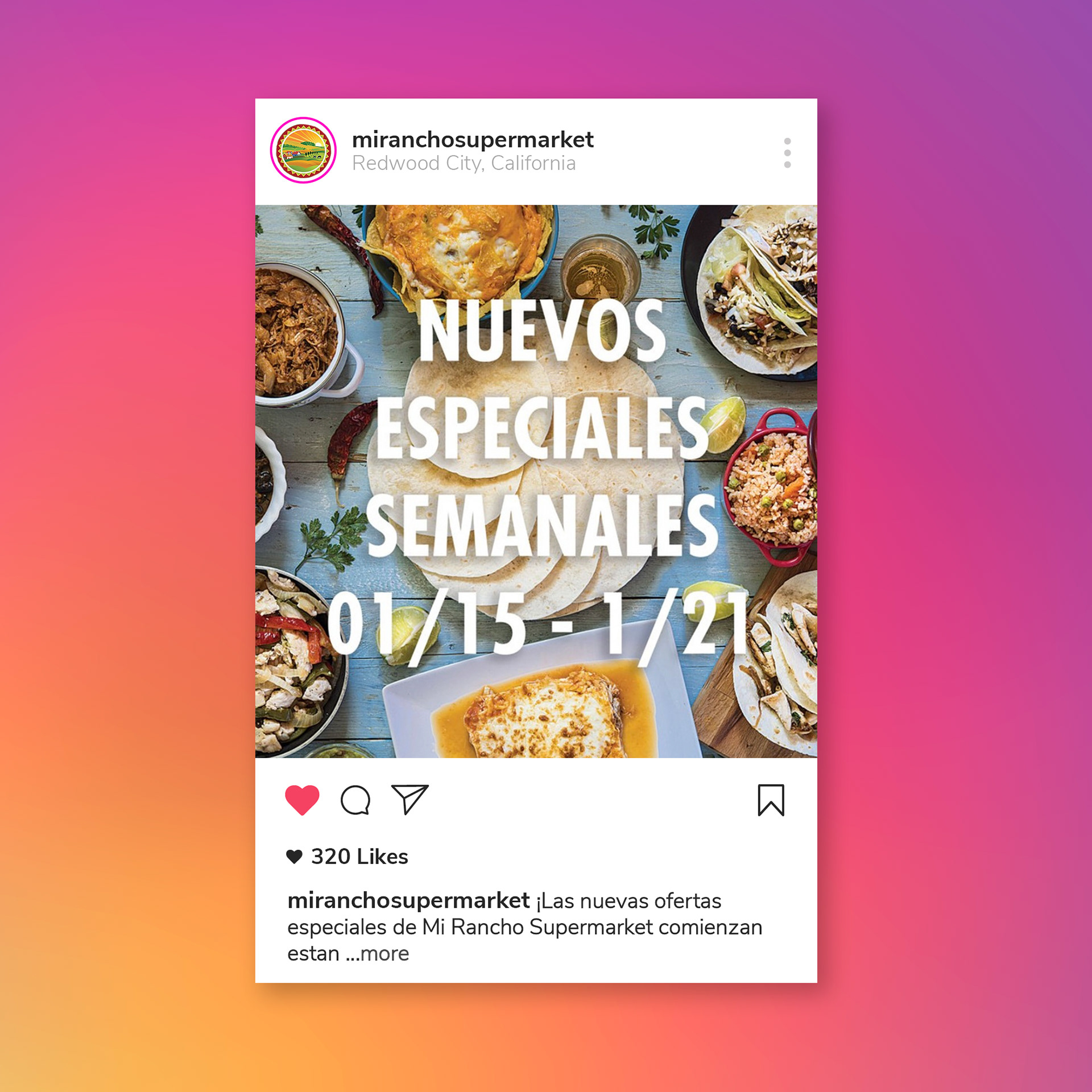
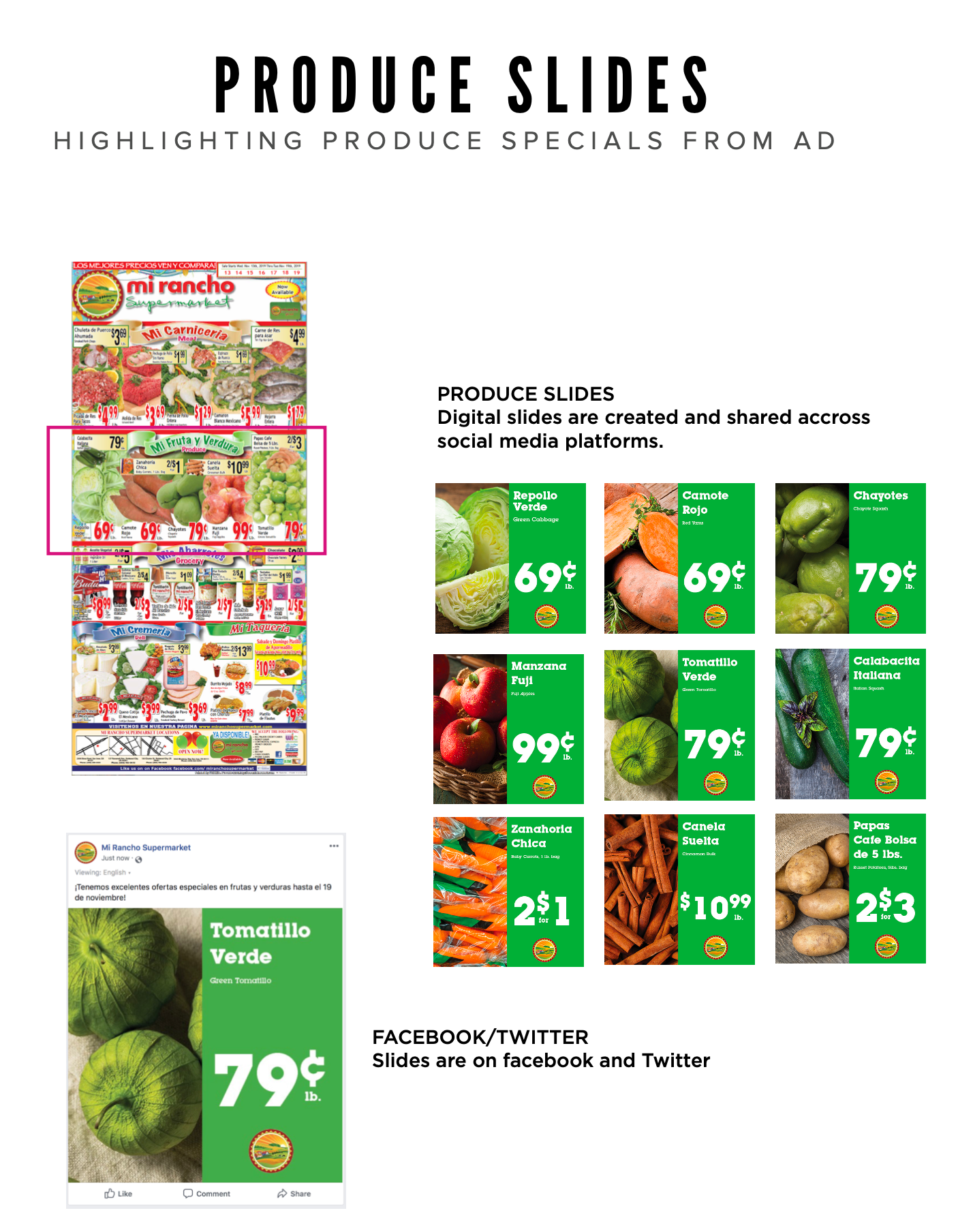
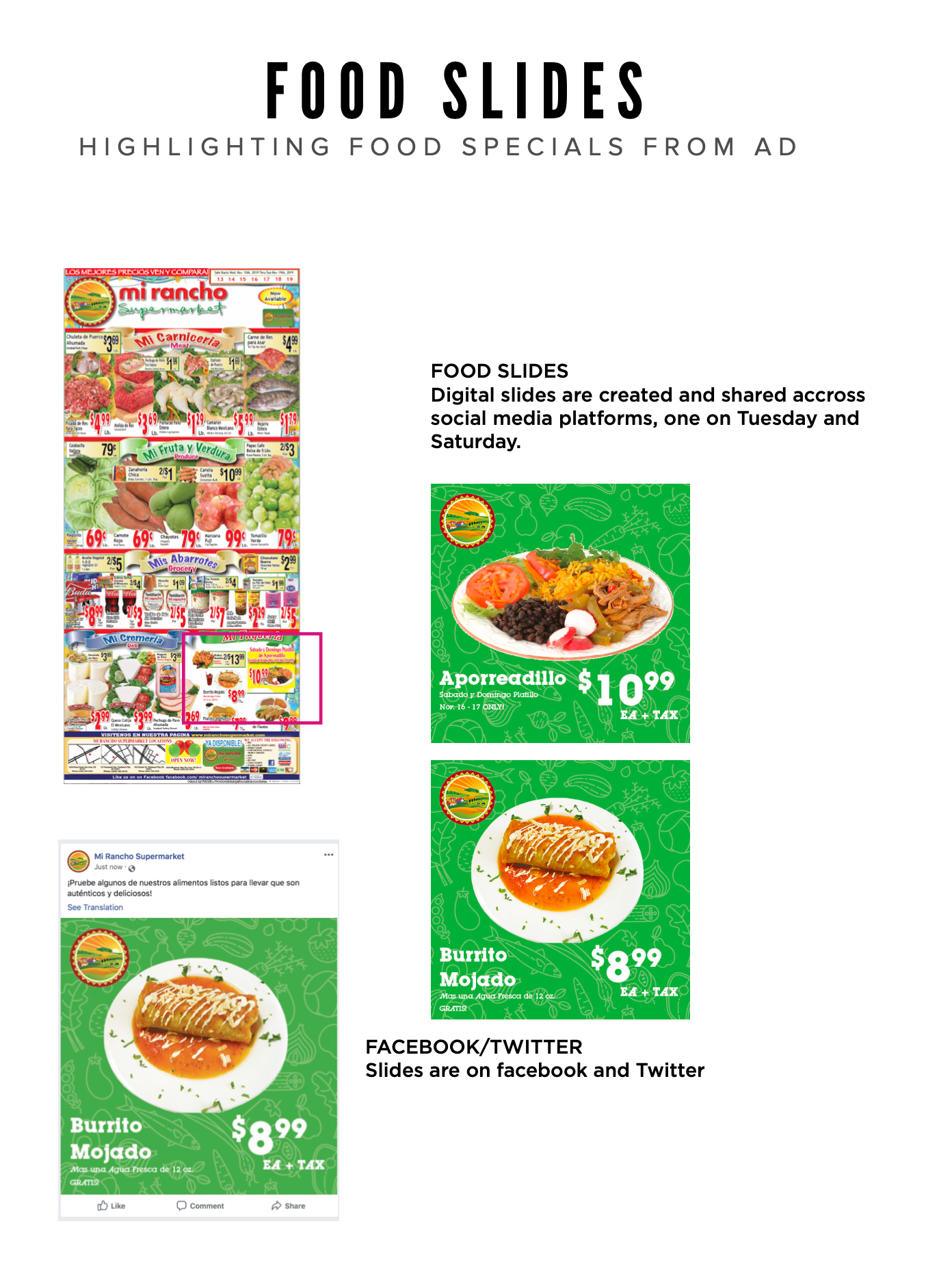
Next, using Adobe Illustrator and InDesign, I created custom graphics that were tailored to the specific social media platforms that Mi Rancho Supermarket used. This included creating graphics for Facebook, Instagram, Twitter, and more.
For the Spanish graphics and copywrite, I was mindful of the nuances of the language and made sure to communicate effectively with the target audience. This included using culturally relevant images/graphics and messaging that resonated with Spanish-speaking customers.
Overall, the process of creating custom social media graphics for Mi Rancho Supermarket was both challenging and rewarding. I was able to exercise my creativity and bi-lingual skills while also ensuring that the graphics were effective in achieving the brand's goals. I am proud of the work I created and I believe that it showcases my skills as a professional graphic designer.

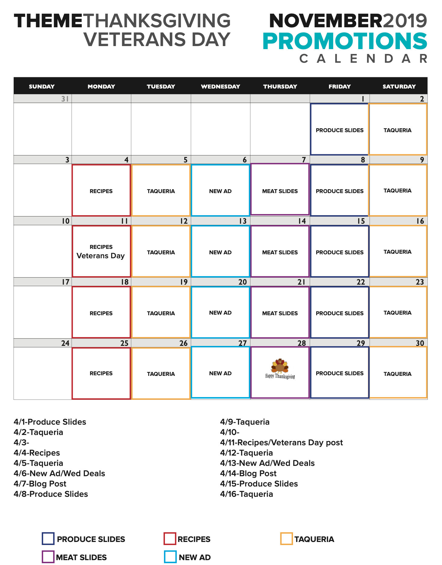
Calendar of the upcoming social posts
